.png)
AUTO INSURANCE QUOTE REDESIGN | USAA Creative Design Intern, SUMMER 2018
DISCLAIMER: This project may seem vague or unclear in certain aspects. USAA is a financial company with proprietary information and therefore I am not legally allowed to disclose certain details. Also, user testing was very difficult at USAA in the short amount of time I was an intern, due to all the necessary regulations and specifications. Please contact me if you have questions or I can help with clarification.
scroll to STEP 6 IF YOU WANT TO KNOW WHY I HAD TO LEARN Sketch in 48 hours.
USAA (United Services Automobile Association)
San Antonio, TX
Role: Creative Design Intern, Auto Insurance Group
Deliverables: Competitive analysis auto insurance quotes & redesigned auto quote flow
USAA is a financial, banking and insurance company. I was part of the Auto Insurance division during the summer of 2018, working on a redesign of the auto insurance quote flow.
Design Director: Darin Duvall
Mentor & Producer: Brandi Hearn
1 | RESEARCH
Submerge
My summer intern project was created after a few weeks in the Auto Insurance group. The project was created to encourage collaboration across the entire auto quote flow, to connect all experience owners and give those who might only design one part of the flow, i.e. Add/Sub Vehicle, a fresh and broader perspective. A perspective from a set of eyes that had never filled out an auto quote, a mind that didn’t know what VIN stood for. Others were pulled in to complete user testing (near the final stages) and I worked closely with my mentor, director, design team and the experience owners in Auto Insurance to understand what work had already been completed.
Two Prong Approach
This undertaking would be two-fold, starting with a competitive analysis of the top auto insurance companies and then letting those results influence the quote flow redesign. That’s all my director wanted to see and I ran with it. This project may have started as an idea but this project grew and became mine with a flair of my own, all the way to the final design.
Pare Down
The research started with over 200 slides of Forrester Data and was narrowed down to 10 slides. It was obvious which companies were standouts with comparable scores, based on experience, the type of platform considered in the ratings and the top 6 companies chosen. The top 2 companies with scores closest to USAA, the top 2 companies that were outliers and the top 2 companies that were small and young insurance companies. (I am not able to share specific company names).
2 | TESTING
Screenshots in Live User Testing
A user test of all 7 (USAA and other top 6) auto quote acquisition flows was completed with a screenshot and detailed notes taken from each, as the process was completed. Notes taken included total completion time, wait times on load screens, search results ranking, delighters, how and when navigation was noticed, "learn more" options, along with depth and breadth, number of steps to completion, the design and accessibility of the company website, and the speed vs. efficiency of flow.
3 | PHYSICAL COMPARISON
Printout Spread
After all flows were completed and noted, the screenshots taken (while completing the quote) were printed screen by screen and laid out one after the other in physical form. This was done to better understand the correlation between the number of steps and time to complete each flow. To see the whole process while mentally comparing how the flow felt vs how it appeared on paper. Also, to analyze the organization patterns of each flow and the impact on completion time, user experience or appearance.
Scale Based Grading
The original plan was to grade each step in a flow for a company on a number scale and then give the flow for a company, the letter grade of A, B, C or D, and see how each company compared to the others. After laying them all out and having a chat with my design team, manager and experience owner it was clear that method was not going to further the understanding of a method to improve the USAA quote flow. So with that scrapped, I began to look more closely at why certain quote flows were easier or more enjoyable to complete (even though an auto quote is not something that someone wants to fill out) and how they were formed and designed.
4 | SITEMAP COMPARISON
Sections for an auto quote might include: Driver, Vehicle, Discounts, Final Info, Purchase.
DISCLAIMER: Those steps are in no particular order, are not USAA's sections
and are general sections that one might encounter on any quote flow.
Chartmap Creation
A chart with a loose sitemap was drafted, with each section listed in a similar fashion as the screenshots were placed physically on the floor, one right below the next, to analyze and compare the differences between order, length, placement and sections.
User Testing Notes
In addition, the notes that were taken during each flow’s completion were sorted. There are reasons why these 7 companies ended up with top scoring numbers; they all are doing something right, but that does not mean they are without room for improvement. The positive and negative aspects (as well as anything similar to USAA) and found through all quote flows were noted put in a document for redesign reference.
5 | WIREFRAMING
Paper Template
Once all the data had been analyzed, it was time for the redesign. First, a blank template was drawn with pen on a single piece of paper and then copied for each screen needed in the final design. All was wireframed first in a paper flow and then reviewed by my mentor, director and one of my fellow interns. I made changes accordingly and went on to create mockups in Sketch because the transitions and "animations/actions" were hard to communicate to a user through a paper wireframe.
6 | MOCKUPS (& INTERN INNOVATION)
I learned the program Sketch in 48 hours. I love teaching myself new skills and this was no exception.
Intern Innovation Design Challenge
This is a side note into the Intern Innovation Design Challenge I participated in, while at USAA. If you don't want to learn about how Team Five created “The Eagle's Nest” then feel free to skip this paragraph. I cannot reveal specifics of the design challenge prompt, however, I worked with two business interns, two IT interns and one full stack developer intern. With 6 people, we had lots of great ideas, ways to execute them and things we wanted to communicate in our final design and presentation. I had the opportunity to lead a mini design session where each of my teammates had a certain amount of time to draw out their wildest ideas design of our final product. Then we went around as a group to constructively critique each idea, pulling the best and scrapping the rest, to reach our final design. This was one of the greatest moments we had, everyone creating a unique piece to offer. My role within this team was Designer, but I also had the opportunity to act as Director, help write the script, construct, and produce the video portion of our presentation, while learning Sketch in 48 hours, to make all the mockups the team needed to clearly communicate our ideas to stakeholders. (certain design aspects and all color have had to be removed from below the below designs)


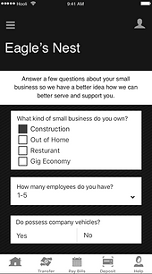


Eagle's Nest mockups created in Sketch and then imported to InVision for demonstration and user testing.
Paper Template to Sketch File
Back to my summer intern project in Auto Insurance. I used Sketch to create all mockups after editing my paper version for round one of user testing. A clickable version was then created on InVision in hopes that this round of user testing would be even better.
7 | TESTING & ITERATION
Internal User Testing
The test group for the InVision prototype was a bit tricky because of the confidential nature of the project. I determined that the best test group would be other USAA design interns, but outside the Auto Insurance sector. It meant they were farthest removed from this project, while still legally able to help.
Clarification
This group of interns was in the same position I had been in at the beginning of summer - completely new to the world of auto insurance. It was interesting to learn that I had used words, acronyms, and descriptions that would make no sense to someone unfamiliar with auto insurance. I had become too close to the project. I had almost forgotten where I had started, and had not incorporated enough "learn more" options and easily accessible information.
Redesign
After having detailed conversations, watching them interact and taking detailed notes, I started the last round of redesign. In the last session of reworking what I had accomplished, I was able to clearly define what I wanted to emphasize. Clear, concise, and consistent. That doesn't just apply when designing an auto quote, though - that applies in all that I design and is an essential component of all design.
8 | FINAL STEPS
Stakeholder Presentation
The final day of my internship proved to be one of the most rewarding. I had the opportunity to present to all stakeholders and experience owners in Auto Insurance by physically displaying my redesign, step by step, on paper, pasted on the wall of a conference room. Alongside my redesign, hung the other 6 top companies auto quote flows, as well as the current USAA flow and they all jumped at the opportunity to ask in depth questions.
Takeaways
I liked that last morning so much because I knew I was able to leave something behind that was bigger than mockups or a prototype. I was able to leave a way for all parts of the auto quote flow experience to come together and truly understand how they all interact and affect one another.
FEEDBACK FROM SUPERVISOR
4 months post internship, Dec. 2018
“I can tell you that people still reference the ‘work that McKenzie did.’ Kim Ryan [Digital Product Manager] brought it up when we were planning improvements to the quote flow for next year.”